The best method to Optimize App icons on Google Play and App Store
-
13/02/2023
-
1112
-
0
- Introduction about App icon on App Store and Google Play
- Simple and Recognizable Design to Optimize app icon
- Appropriate Colors to optimize app icon
- Consistent Branding to optimize app icon
- High Resolution to optimize app icon
- User Testing to optimize app icon
- Versatile Design to optimize app icon
- Conclusion
An app icon is a graphical representation of an application or software program. It is the first visual element a user sees when browsing app stores or installing the app on their device. Here is the best method to Optimize the App icon on Google Play and App Store.
Related posts
How To Rate An App On Google Play And Apple App Store In 2023
How to increase app reviews and app ratings for Android or iOS apps free
Introduction about App icon on App Store and Google Play
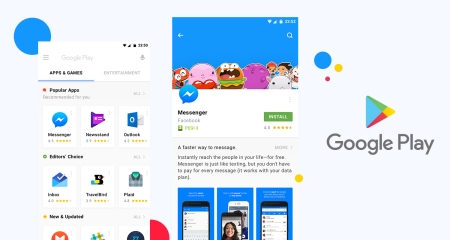
App Store and Google Play are the two largest app distribution platforms for mobile devices. The App Store is operated by Apple and provides a marketplace for iOS users to download and install applications for their iPhones and iPads. Google Play, on the other hand, is operated by Google and provides a marketplace for Android users to download and install applications for their devices.
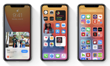
![]() Optimize App icon, Source: Asoservice.com
Optimize App icon, Source: Asoservice.com
App icons are essential in both the App Store and Google Play. They are used to represent an app in the app store and are a critical factor in attracting users to download and install an app. A well-designed app icon can make an app stand out in crowded app stores and increase the chances of a user downloading it.
Both the App Store and Google Play have guidelines for designing app icons, including size and resolution requirements, as well as guidelines for color, contrast, and visual style. These guidelines ensure that app icons are visually consistent and meet the technical requirements of the platforms. You can buy App reviews from real users for your app to increase app ranking.
Simple and Recognizable Design to Optimize app icon
Yes, a simple and recognizable design is critical in optimizing your app icon. Here are some ways to help you achieve a simple and recognizable design:
- Use clear symbols and graphics: Use symbols and graphics that are universally recognizable and easily associated with your app's purpose. This will help users quickly understand what your app does.
- Limit the use of text: Keep the text on your app icon to a minimum. If you must use text, ensure it is easily readable and consistent with your brand's typography.
How to keep your icons looking consistent, Source: Youtube
- Keep the Design clean and straightforward: Avoid using too many elements or overly complex designs, as this can make your icon challenging to understand at a glance. Instead, focus on creating a clean and straightforward design. That accurately represents the purpose of your app.
With these tips, you can create an app icon that is simple, recognizable, and visually appealing. Making it more likely that users will be interested in downloading your app. App developers can increase app installs from Google Ads campaigns for Android, and iOS Apps, and games.
Appropriate Colors to optimize app icon
Yes, choosing appropriate colors for your app icon can play a significant role in its success. Here are some tips for choosing appropriate colors for your app icon:
- Choose eye-catching and appropriate colors: Bright colors can help attract attention to your app icon, but be sure to choose colors that are appropriate for your app's purpose and target audience. For example, a financial app may use a more professional and muted color scheme. While a children's game app could use brighter, more playful colors.
60-30-10 Color Rule, Source: Youtube
- Consider the background color: Consider the context in which the app icon will be viewed, such as on a white or light background, and choose colors that will still be easily visible and distinguishable in these environments.
- Consistent with the brand color scheme: If you have an established brand with specific color schemes, ensure that these colors are incorporated into your app icon. This will help establish a strong brand identity. And make your app icon more recognizable.
Choosing appropriate colors for your app icon. You can make it more visually appealing and memorable, increasing the likelihood that users will download your app.
Consistent Branding to optimize app icon
Consistent Branding is crucial in optimizing your app icon, as it helps create a strong brand identity and makes your app more recognizable. Here are some tips for incorporating consistent Branding into your app icon:
- Incorporate elements of your brand: Consider incorporating elements from your brand, such as your logo, typography, and color scheme, into your app icon. This will help reinforce your brand and make your app more recognizable.
7 GOLDEN RULES For Icon Design MUST KNOW, Source: Youtube
- Ensure consistency across all platforms: Ensure your app icon is consistent across all platforms, including the App Store, Google Play, and your website. This will help create a strong brand identity and make it easier for users to recognize your app.
- Create a strong brand identity: Your app icon is often the first thing users will see when they discover your app. So making a solid first impression is essential. Consider using your app icon to create a strong brand identity that accurately reflects the purpose and personality of your app.
By incorporating consistent Branding into your app icon. You can create a solid and recognizable brand identity, making it more likely that users will be interested in downloading your app. Buy Google reviews from high Local Guides will increase app ranking for businesses.
High Resolution to optimize app icon
A high-resolution app icon is essential for optimizing your app's visibility on the App Store and Google Play. Here are some tips for creating a high-resolution app icon:
- Ensure clarity on all devices: Your app icon must be clear and visible on all devices, from high-end smartphones to older devices with lower resolutions. Consider the screen sizes and resolutions on which your app icon will be viewed and design accordingly.
- Consider the different sizes required by the App Store and Google Play: Different platforms require different sizes for app icons, so make sure your Design remains clear and recognizable at different sizes.
- Maintain clarity at different sizes: Your app icon will also be displayed in different sizes on various parts of the App Store and Google Play, such as on search results. So make sure your Design remains clear and recognizable at smaller sizes.
By creating a high-resolution app icon. You can ensure that your app is easily visible and distinguishable on all devices. Making it more likely that users will be interested in downloading it.
User Testing to optimize app icon
User testing is a great way to optimize your app icon. User testing aims to gather feedback from real users to understand how they perceive and interact with your app icon. Here are some methods you can follow to conduct user testing for your app icon:
- Define your target: What do you want to learn from user testing? Do you want to test the app icon's recognition, appeal, or ease of use?
- Recruit participants: Find users who fit your target audience and invite them to participate in the testing. You can use online platforms, social media, or other recruitment methods.
Product Page Optimization - A/B Test Your Icon in the App Store & More! Source: Youtube
- Prepare the test materials: Create a clear and concise script for the user test. And ensure you have all the necessary materials, such as a prototype or a screenshot of the app icon.
- Conduct the testing: Ask users to complete specific tasks related to your app icon, such as finding the app in a list of apps, describing what the app does based on the icon, or ranking the app icon compared to others.
- Analyze the results: Review the feedback and observations from the user test and look for patterns or trends. Take note of any areas of improvement and consider making changes to your app icon based on the feedback.
- Repeat the process: User testing is ongoing, so don't be afraid to repeat it several times to gather more feedback and continually improve your app icon.
By conducting user testing. You can get valuable insights into how users perceive and interact with your app icon and make data-driven decisions to optimize its Design.
Versatile Design to optimize app icon
Creating a versatile design for your app icon can help optimize its appearance and appeal to a broader range of users. Here are some tips for creating a versatile app icon design:
- Please keep it simple: Users can easily recognize and remember a simple, clean design. Avoid using too many colors, shapes, or intricate details.
- Use recognizable symbols: Using symbols or logos that are easily recognizable can help users quickly identify what your app does.
- Choose appropriate colors: Choose appropriate colors for your app's purpose and target audience. Consider using colors easily differentiated from others in the app store or on a user's device.
App Icon Design Tutorial | Adobe Illustrator CC, Source: Youtube
- Make it scalable: Your app icon should look good in different sizes, from the small icon on a user's home screen to the more prominent icon in the app store. Make sure the Design is clear and legible in all sizes.
- Test it in context: Test your app icon in different contexts to see how it looks and performs in different environments. For example, test it on various devices, against different backgrounds. And in different lighting conditions.
With these tips, you can create a versatile design for your app icon. That is easily recognizable, memorable, and appealing to many users.
Conclusion
Optimizing your app icon is critical in creating a successful mobile application. A well-designed and optimized app icon can increase the visibility and appeal of your app in crowded app stores. Leading to more downloads and a more extensive user base. To optimize your app icon, consider conducting user testing to gather feedback and insights from real users. Create a versatile design that is easily recognizable and memorable, and follow the App Store and Google Play guidelines. Additionally, continually test and iterate on your app icon design to ensure that it meets the needs and preferences of your target audience. By taking these steps. You can create an app icon that accurately represents your app, is appealing to users, and stands out in the app stores.
Related posts
https://asoservice.com/best-guide-to-run-ads-for-mobile-apps-on-twitter-2023
https://asoservice.com/android-ios-direct-app-downloads-installs
Thanks so much for reading this article.
Source: https://asoservice.com/










Leave a Reply
Your e-mail address will not be published. Required fields are marked *